Many Amazon private label sellers do not invest enough thought into their products’ packaging design. Proper and creative planning of your product packaging in advance can save you production, shipping, and storage costs, increase your profit, prevent unnecessary returns, and create significant differentiation from the competition.
When you design a box for your customer, you design an experience.
The difference between product that seats on the shelf in a retail store and receiving a package from an ecommerce site, is the first interaction with the customer.
Opening a package that was received in the mail has a strong psychological effect on the customer.
The purpose of the package in the RETAIL store, is to attract the customer to the shelf on which it sits, while in ecommerce the purpose is to surprise, excite, and reinforce the purchase.
Here are
5 tips for smart and cost-effective packaging design for your Amazon product
1. The Element of Surprise
Part of the shopping experience is receiving the package, open it, find the gift or the thank you card, but have you ever thought about incorporating a scent into your package? What about a surprising voice asking the customer to rate the product? Or even something funny that will make your customer roll with laughter?
We have often done all these and more for our clients as part of the complementary shopping experience for their customers.
Be creative, open your mind and think of something that will bring the element of surprise to your package.
2. Functionality
Think about whether your packaging can be part of the product or be a complementary product.
Instead of investing in durable or expandable carton, you can create multi-purpose packaging. Except from being green, you will also provide your customers with added value, create differentiation from the competition and this is a package that the customer will not throw away like others, so you can think of imprinting a message on it, something that you wish your customers to always see.
Need a few examples? For baby products the packaging can be a diapers holder, for a knife the package can be made of wood and be used as a cutting board, for a makeup set the package can become a stand that will hold the makeup brushes.
Be creative and think outside the box.
As part of our sourcing, R&D, and manufacturing services, we help our clients to develop and design not only the product itself, but also the create the perfect product’s package. So I can tell from experience, there really are an infinity of creative ideas and possibilities.
3. Brand Language & Colors in Marketing
As a private label seller your goal is product branding.
It is important to understand that every brand must have a brand language that includes the colors, fonts, phrases and all the contours of the brand.
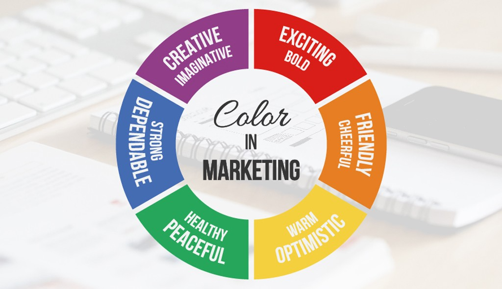
Colors have a dominant effect on the messages we want to convey. They affect customers’ mood, emotions and causes different responses. For example,
Red transmits energy, strength, danger
Blue confidence and reliability
Green implies the environment, nature, growth, health
Purple symbolizes nobility, luxury, mystery
Therefore, it is important to conduct research before deciding on the colors for the brand language and not to choose them arbitrarily.
When you work with different suppliers and service providers, you must share with them your brand language, and explain them the message you want to deliver to your audience, so that they know how to relate to your brand and use the right phrases, fonts, and colors.
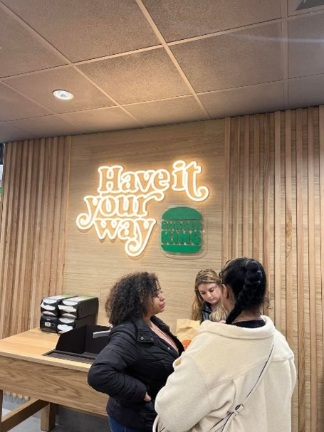
What ‘s in the pictures ?
Below: Colors in Marketing
From the right: Notice how the change of colors in the Burger King logo in London receives a completely different meaning.
This branch serves only vegan food. Notice how the branding speaks out from a simple change of colors.
4. QR Code
Improve your customer experience and your communication with him by upgrading your product insert to a QR code.
Printed manuals that come with the product are often find their way to the nearest trash bin.
Using a QR code instead of paper is not only cost effective but also presents you as a caring brand that look after the environment.
Another great advantage is when the customer scans the code, he can go to any website or landing page you want. This allows you to communicate directly with your customer. You can also use it to upgrade the customer’s experience by including on your site video tutorials, attractive and explanatory photos, you can gently ask the customer to leave you a review, give a discount coupon for next purchase or present additional products from your collection.
To help you take your customers’ experience to the next level, we have created the MYQRGUIDE system. This system was built especially for ecommerce sellers.
In addition to all the options we mentioned above, this system allows you to create your own Mini Site where you can upload your PDF guides and the client is able to translate it automatically to any language he wants. The system also generates QR code automatically and you can give it a special design with interesting frame and different colours. Other features you have are uploading product video, provide attach customers with product warranty, join clients to your VIP club and create your own list of leads, receive reviews, communicate directly with customers online or create an automatic chatbot, send emails with templates you have created in advance, receive detailed consumer behaviour reports, synchronize your other ecommerce platforms such as, WooCommerce / Shopify and many more advanced options.
To open a free user and explore more options of the system click here.

5. Practical Design
Usually, Amazon sellers pay more attention to the graphic design and less to the type of packaging, size, and thickness. There are cardboard packages, blister (plastic combined box), textile packages such as bags, metal, wood, etc.
It is important to understand the main purpose of the package.
Besides giving us the WOW Effect, it is also the tool that supposed to protect the product through the whole journey of the logistic chain. From the factory > truck > ship > truck again towards the warehouse at Amazon > truck again all the way to the client. If you are working with a third-party warehouse than there is an extra truck from the 3pl centre to Amazon.
Product’s Package shouldn’t be just beautiful and well-designed, it must be practical and especially protective.
If you have decided to make a die cut and go with your own design or even if you choose the factory’s design, you must first make sure that the package will protect the product and ensures that the product reaches the customer in good condition. Only after you made sure of that, then you can concentrate on making the package beautifully designed.
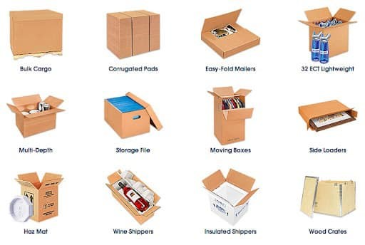
So how do you choose the right box?
It is important to think deeply about this and not settle for just a standard.
Factories usually know how to properly pack a product that they manufacture but do not always do the right packaging because they want to save cost or because their lack of creativity. Which is why you should consult with the supplier and if he sees that you are asking the right questions you may get surprising answers.
Here are some guidelines for planning and choosing the right box:
– Check the desired sizes. “How do I prevent from the product to move inside the box?”
– Think about the thickness of protection layer that the product should have from the outside world and how much it is affected by it.
– Which box will minimize product’s volume (to save costs)
– “Will my product be protected in this package?”
– “Will it survive all the long logistics chain?”
– “Will my product be scratched or broken with this way of packing?”
– “Will the package hold the weight?”
– “Will the package stay in the same condition as it left the factory, after the long logistic journey it needs to go through?”
– “What will give me the best WOW Effect?”
– Finally, preform a Drop Test to make sure that the box you are using will last
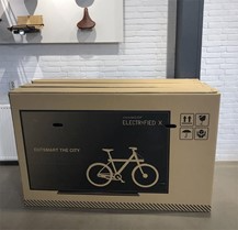
Here’s another creative example of package design
When this bicycle company Vanmoof wanted to make sure that people will be more careful with their product during its entire logistics chain, they put a picture of a TV on the packaging.
It may sound funny, but according to the company it has reduced the number of fragments by 40%, which makes ones think that sometimes it is also important to take the creative design of the master cartons (for fragile products) into consideration.
Last recommendation to end the article!
If you use a product’s package designer or a graphic designer, it is important that you explain them the messages you want to convey to your customer, make sure they have experience with ecommerce products and not retail, because it is a completely different approach.
Of course, our R&d and design team at Game On Group is always at your service.
Want to design smart and creative packaging for your products? One that will differentiate you from the competition and your customers will remember and appreciate?
You are welcome to schedule a free consultation here.
We will be happy to develop new ideas with you, help with branding and graphic design that will speak the language of your brand.
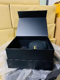
Pictured is a surprise gift box we created for one of our customers who prepares surprise kits for NBA players.
- 2021 GameOn Group C.L LTD All Rights Reserved
*The content of this article is a collection of daily tips from the leading Facebook group
#Everyday Tip for E-Commerce – Amazon Alibaba eBay and everything in between
